
Logo & branding & concept development for a sports science consultancy business BAR.
BAR is aiming to decrease the number of injuries and dropouts in the sports industry and increase the number of successful athletes by bridging the gap between well-funded clubs and athletes who do not have access to the proper services. It will be made by collecting a mass collection of data from sports throughout playing levels and creating better evidence of practices for the use of clubs and athletes.
„A Weak base of the athletes’ pyramid is a recipe for disaster in our eyes – it has consequences of the unnecessary occurrences of injuries and drop-outs throughout different levels of a sporting carrier due to lack of knowledge or ability to supply proper service. <..> Creating better athletes, many academics shy from the field and many practitioners shy from academia. I want to bridge this gap and create better athletes through the widening of the base of the pyramid so quality sports would reach the masses and not only a few at the top.“
Bar Kohav
The signature is a powerful three letters’ combination which evokes the culture of athletes – a connection between the strength and progress. The Logo Symbol has a particular relationship with the founder’s name Bar and business name’s meaning – Better Athlete Results. It expresses movement, progress and getting better every day. The Logo Type has been carefully chosen for its modern, strong, yet refined and highly legible style, which has been further enhanced by the use of upper case letters. The typeface has also been chosen to compliment and balance perfectly with the logo symbol. The corporate logo is presented through the use of colour as well as shape and form. The primary branding colour is Black – classic and timeless, represents strength, power and control as well as sophistication.

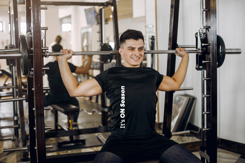
Merchandise
T-shirts are part of the brand strategy to support and
raise a fund to develop the project.
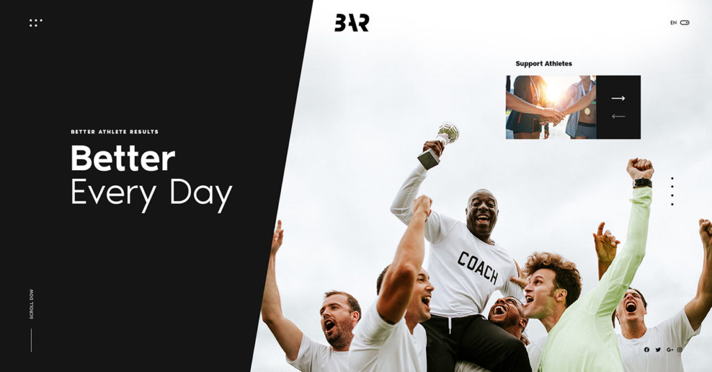
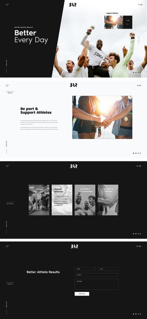
Landing page prototype
Consistency is built into the foundation of developing visual identity.
The web page itself establishes a uniform color and graphic elements pattern.
It supports the brand’s mission and vision as well as gives the website
a polished and professional feel, which boosts brand credibility.